Unconditional love, spread naturally.

Year
2020Services
- Brand Name
- Brand Positioning
- Brand Strategy
- Logo Design
- Packaging Design
- Social Media Marketing
- Web Design & Development
Challenge
In the cosmetic industry, when we use the words, 'natural products' how many brands come to mind? How many of them are actually trustworthy? The number of answers to these questions are too many, and at the end, there are only a few brands that customers end up buying products from. Kelesta wanted a spot here and that was exactly the challenge. But that was not all, the positioning in terms of pricing had to be precise too; not very expensive, not very cheap. Just somewhere in the middle. Where exactly-that was to be figured out.
Insight
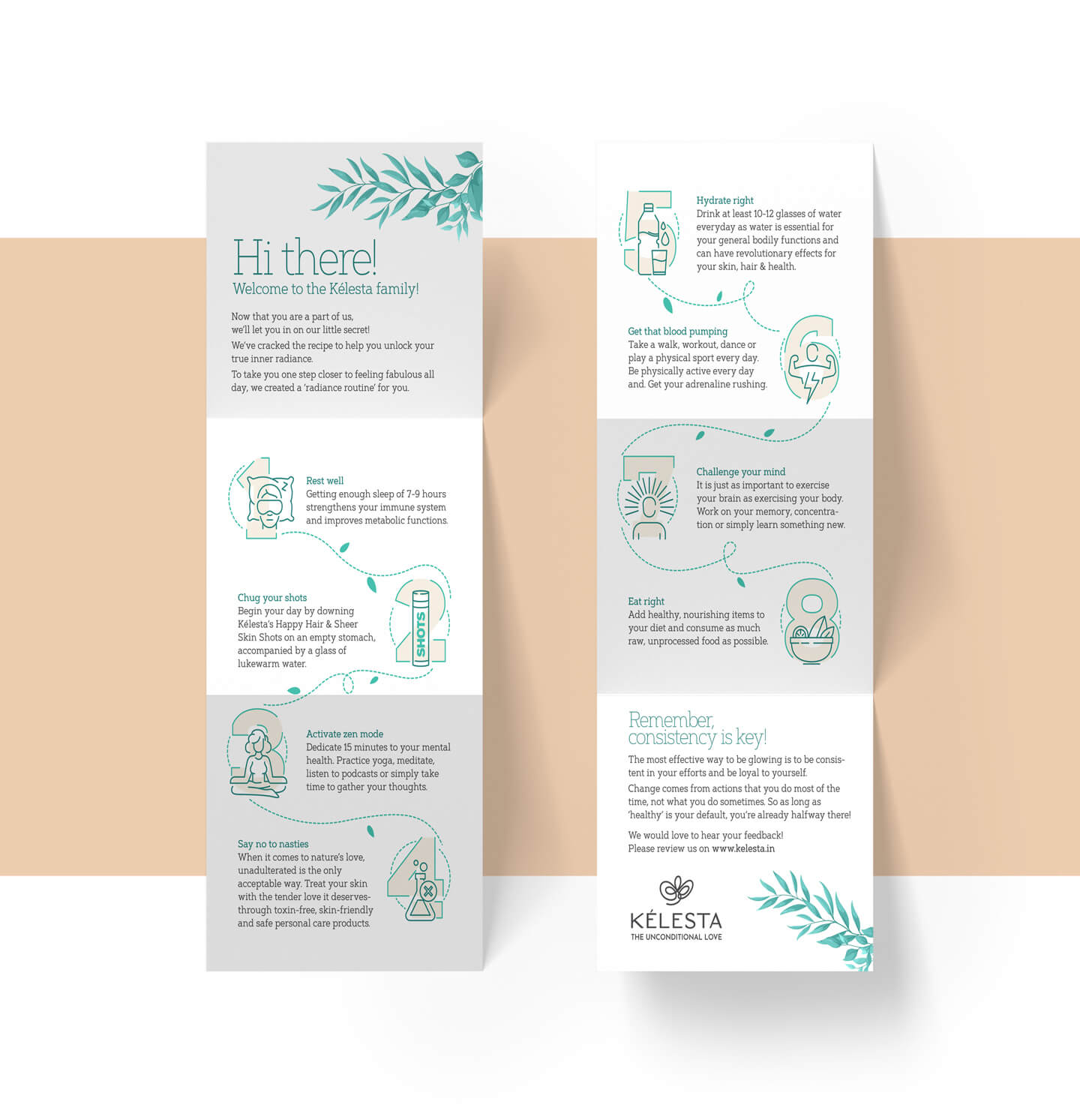
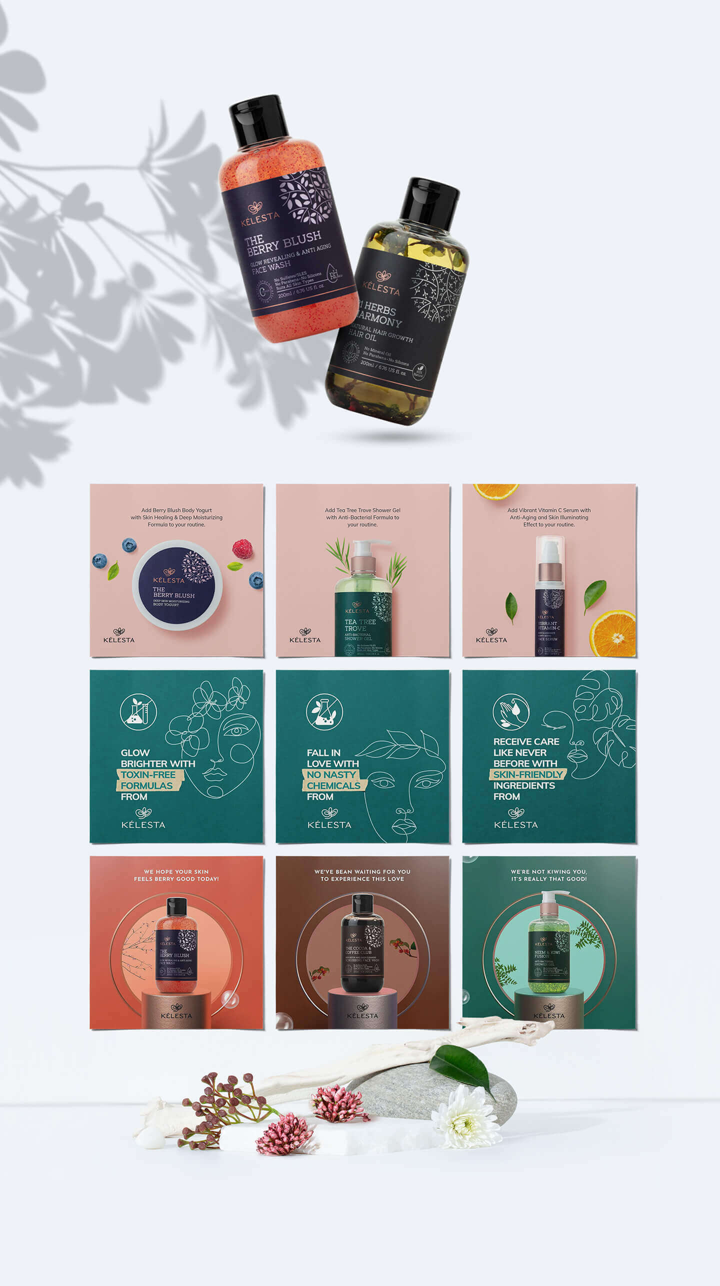
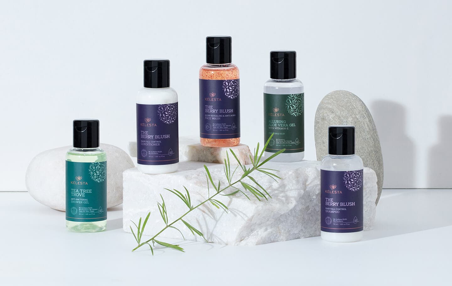
Although Kelesta's products fall in the chemical-free product segment, they had to use some chemicals such as preservatives, needed to make the product last longer than just 6-8 months. But, these chemicals were not harmful chemicals either, and that awareness had to be spread by educating the consumers. The competitor brands in the same category had a highly cluttered identity and communication, be it on the packaging or in the digital space. So we understood that delivering a clean look with a direct line of communication was going to be a necessity.


Solution
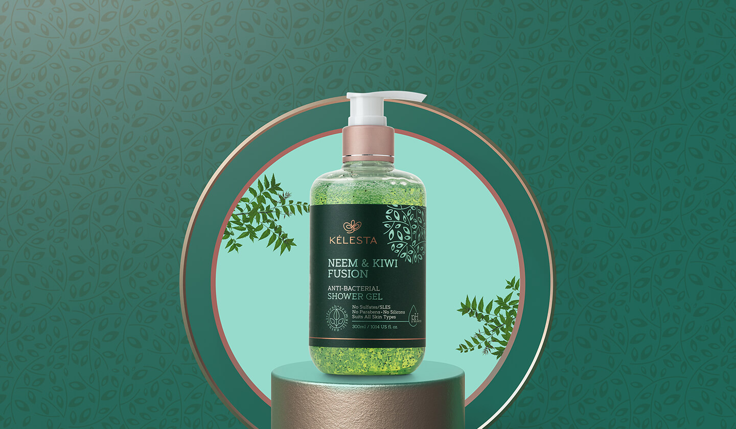
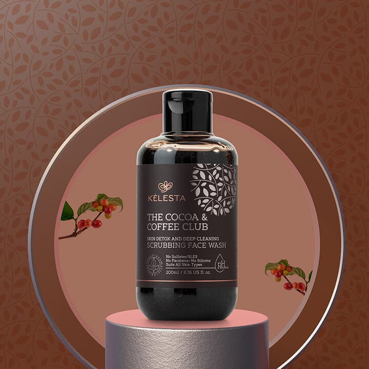
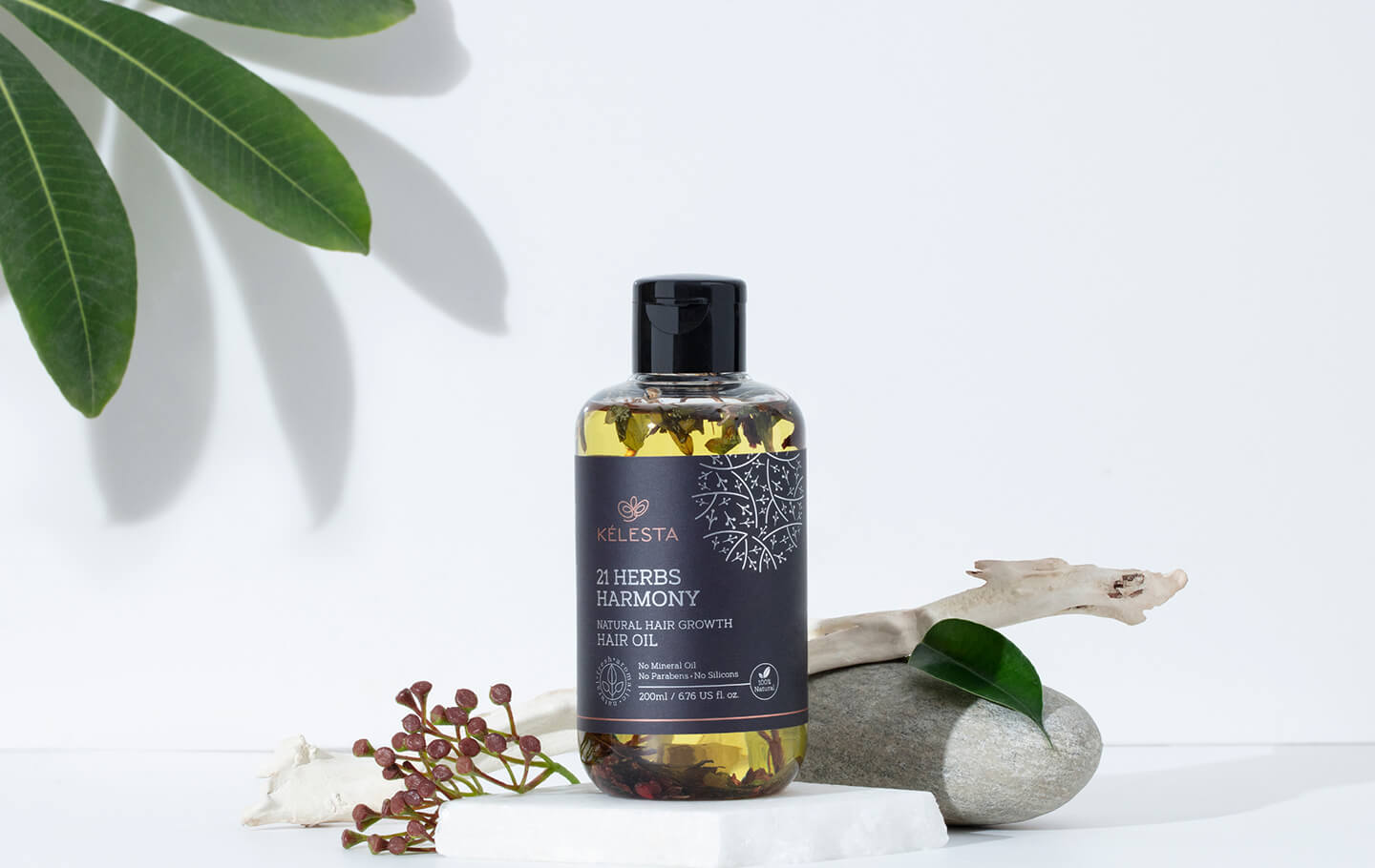
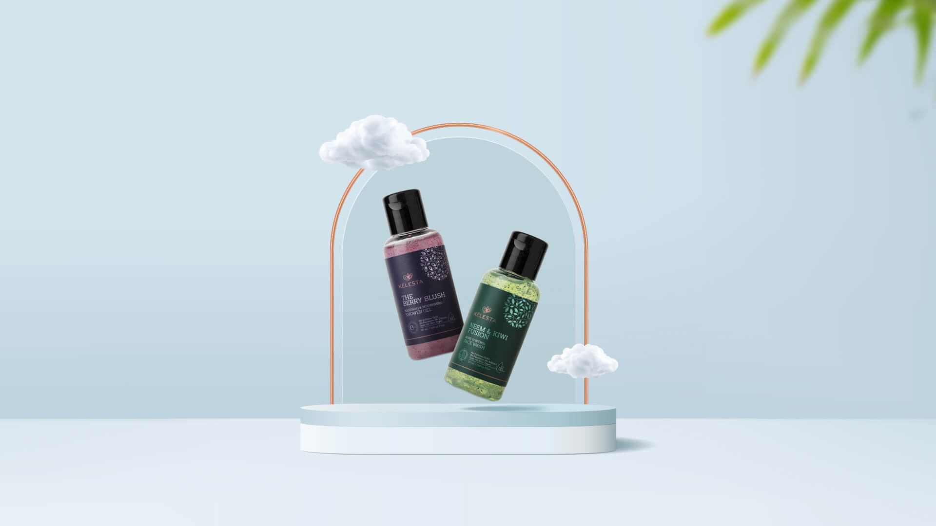
A Celestial Kelesta.
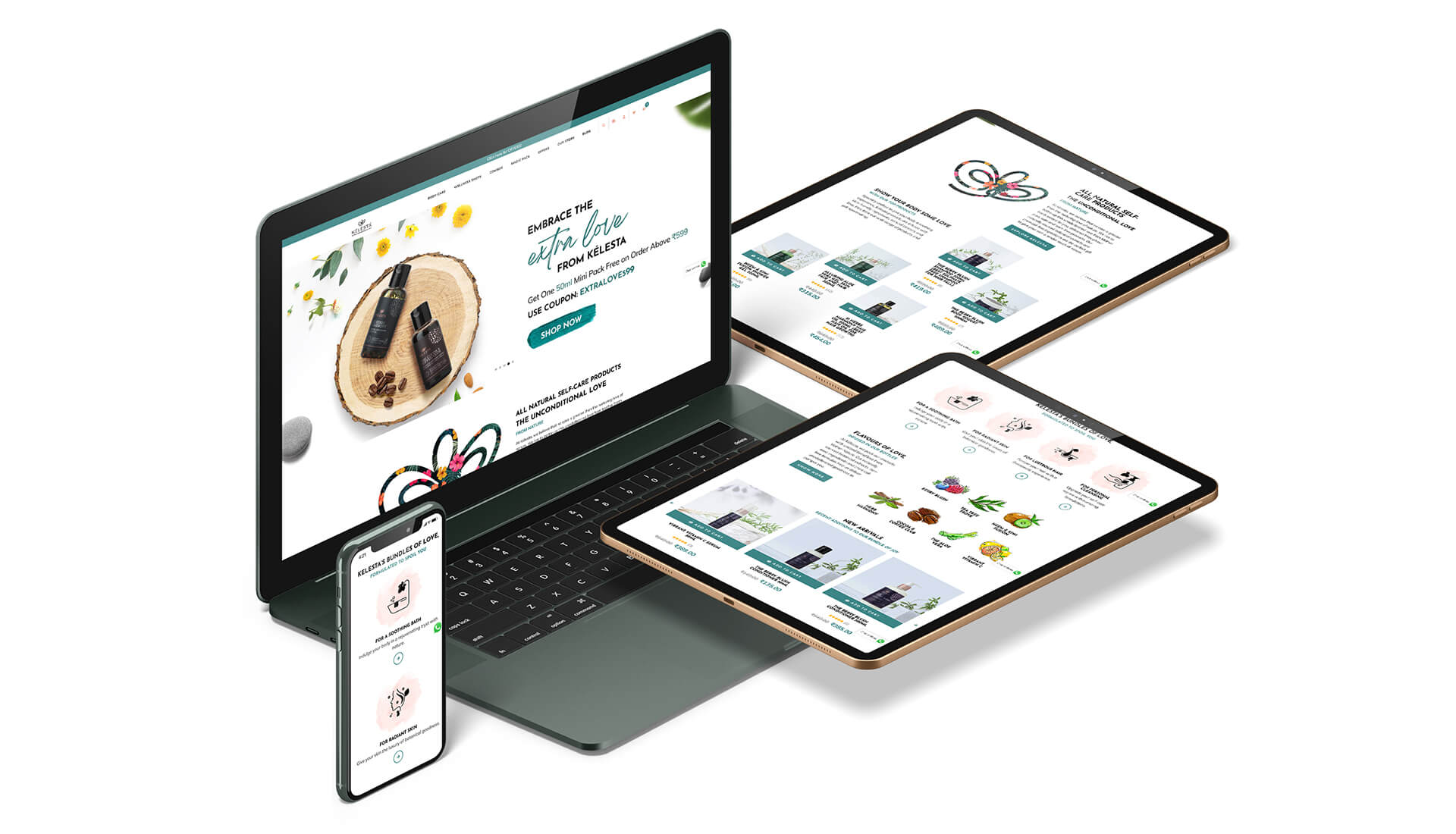
The brand name Kelesta was derived from the word 'celestial' and the logo was an inspiration drawn from the angelic language symbol representing 'unconditional love'. After the logo, we moved on to the packaging, the photography and the website. The metallic packaging of Kelesta has shapes and forms that signify the natural ingredients contained in each of the product variants. We also launched the brand on digital platforms and centered the communication around educating the consumers about skincare & haircare, highlighting the aesthetic looks of the packaging at the same time.